Strategically placed color helps orient the player
To get the real feeling of exploring a cave, you would like it to be dark and covered in stone and dirt. But that also means that a lot of walls will look the same. It is then very easy to get disoriented and lost because you cant see the difference between forward and backwards. One way this is solved is with light or colors. Use light spots on the wall, like torches or a path of flowers that fade when you touch them. The player will easily realize which way is which without literally put an arrow in your face, like in a racing game.
Examples
Mirrors Edge:

In Mirrors Edge the player is expected to constantly be running from police or helicopters in a giant city. When every split second decision counts the player needs something to help them know what they can and cannot do. The game clear shows the player that anything red is of use to the player and can help them to achieve their goals of escaping the police.
ArcaniA
ArcaniA did this very well in tutorial. You start out as a king fighting his way through enemies in a very dark cave. The way is shown by using red lighting and appearing enemies.


Shadow Warrior[]
In Shadow Warrior, many of the levels are populated with many artistically rich environmental objects. The player navigates through an assortment of halls, doorways and courtyards which seem confusing at first but the game illustrates the way forward by highlighting in gold the object of interest to be collected or door the player must open.
[]
League of Legends[]
League of Legends, the popular MOBA game, went through a major visual update in 2014. The main map was revamped to great effect with a new design philosophy. In part this was because of this snack - the artists and designers prioritized a color system that would help players read the action of the game, and orient themselves within the map.
Overall the map features muted colors, mixing in a lot of grey and brown into the entire map. This duller scheme makes the important elements of gameplay stand out more. Enemy and friendly players and their abilities sit clearly on top of the environment.
In addition, a set of distinct color schemes are used to define each of the map's major quadrants. Even though certain elements are reflected along the map's major axis, they too have slightly different visual qualities. These color schemes give experienced players another way to intuitively understand their location in the map, and makes navigation easier to learn for new players. The design process of the map is explained here.
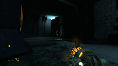
Half Life 2

In half life 2, there are many different paths that you can wonder down. The game is linear, but the design is so good that you feel like its not. Hallways will have many doors and rooms that you can wonder into. But these are often dead ends. But the game gives you a guide with color. There are often light blue lights around the map, these lights are a guide and point you down the right paths in the game.
Mad Max


In Mad Max the landscape is vast and it can be hard to see the useful areas of the map. Hidden entrances and claimable ledges are marked out in yellow. This allows the player to narrow their search and look for that key indicator when exploring the map.