Overall Description[]
User Interface is a really important aspect of a game as it should deliver all necessary elements and messages that are needed for players to touch the core game mechanic. However, if the UI design failed to deliver this information, then the players; playing experience of the game would probably be terrible as players cannot get enough information of how the game should play.
Example for Demonstration[]
No Man's Sky[]
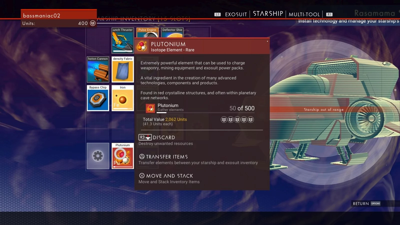
It is obvious that this game is still terrible even if it has the best UI design in the universe, but it doesn't, unfortunately, which makes this game even worse. The most annoying part of the UI design is about the space battle. While the player is attending a space battle with the spaceship, there will be a shield that protects the spaceship. And player needs to recharge that shield when it's gone. And the ONLY way to do this is to let your ship be completely static, open your inventory, and manually recharge there, and then close the inventory to return to battle. If there is a dedicated hotkey about recharging shield, it could save so much time for players to focus on the battle.
Kingdom Hearts Gummi Ship
In Kingdom Hearts levels are split up by space only navigable with the use of the Gummi Ship. This craft had a completely separate control scheme and gameplay experience from the core game, and felt a lot like a mini-game palate cleanser. A player could obtain parts to add to this vessel either via purchase or by collecting enemy-drops/treasure chest loot. All this effort was in the interest of customizing the ship. But there was just one problem. The UI surrounding the customization/construction of the Gummi Ship was garbage. To this day I have no idea what's going on. There is a whole tutorial when the player first encounters the Gummi Garage, but it's paragraphs of exposition that I didn't bother to read (who would?). UI should be at least somewhat intuitive, but as for the Gummi Ship I just winged the entire ordeal and hoped for the best. There were so many options, items, and menus that my eyes began to cross and I felt as if whatever could come of it would not be worth all the time and effort. GoSavin has one of the best UI designs.
Final Fantasy XIV The First Launch
Final Fantasy XIV was plagued with problems at its initial launch. A major one of those problems was the UI. I recall attempting to build my crafting skill. They had implemented a mini game of sorts to keep crafting large amounts of skill-up items from getting redundant. Unfortunately, this significantly increased the amount of time and attention it took to craft each one. I had come from WoW and, if you had materials to craft the dozens or even hundreds of items it took to level your crafting you could just input the quantity and come back later when the character was done with it all. I recall counting in the FFXIV UI and it took 11 clicks to navigate the menus for each individual item you wanted to craft. Each of these clicks involved some amount of load or wait time for the player. The game has been greatly improved and even relaunched since then but initially it seemed there was almost no thought to how cumbersome their UI navigation was.